Allen Legal are a commercial law firm who offer clients a full range of corporate and intellectual property legal services. Founding partner, Mark Allen has a professional (and personal) interest in technology and innovation. He understands the needs of entrepreneurs and innovators; from starting a venture, to scaling, acquisition and exit. He created Allen Legal to help them commercialise, leverage and safeguard their innovation, technology and IP, thus enabling them to focus on what they do best; creating, testing and building.
The original Allen Legal branding did not convey their specialisation with innovation. The logo consisted of a triangular orange monogram. This resembled a local real estate business rather than a legal services firm. The logo, style and application was generic, old fashioned and did little to distinguish them from competitors, or even other professional services. With competitive law firms relaunching with new identities which challenged the dry design found in the sector, it was time for Allen Legal to change as well.
We were approached to create an identity that would dramatise Allen Legal as the go-to experts for realising the commercial potential of ingenuity and innovation, and the value this offers entrepreneurs. It was also essential the new identity would be grounded and trustworthy – key ingredients to branding the legal sector.
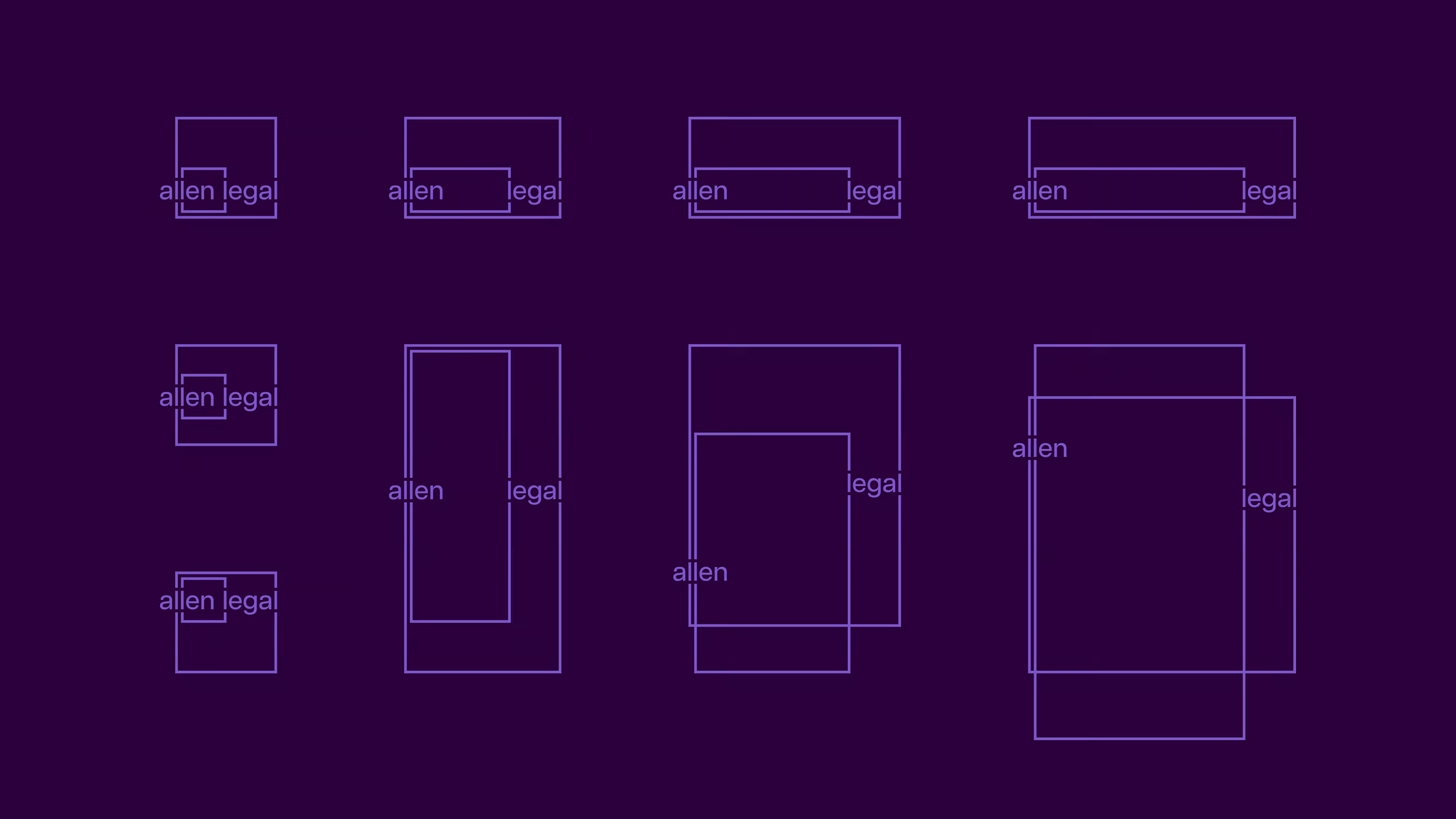
Our idea extended the four L’s contained within the Allen Legal name, forming a box within a box. This flexible graphic visualised the concept of ‘scaling’ and of ‘thinking both inside and outside the box’. We extended the idea across all applications, designing a contemporary look and feel, typographic style, colour and photography.
Our new branding and dynamic styling successfully relaunched Allen Legal, repositioning them as legal experts in commercialising ingenuity. The new corporate identity stood out amongst competitors and struck the perfect balance between trust and innovation.