Relatively speaking “The Tiling Guys” was a small startup project for Propella, but for Gary (our creative director) it was particularly special because it gave him an opportunity to help not only an old friend, but a veteran of the Royal Navy. Our goal was to quickly establish the brand as a serious player in the North of England and lay the foundations for franchising opportunities. It was important the brand would be ‘people-centric‘ with a ‘can-do, problem-solving attitude’ that was both ‘fun and creative’.
“The Tiling Guys” is a new tiling business based on the Wirral Peninsula close to Liverpool in the UK. Mark, the founding partner already had ambitious plans for national expansion, with a view to creating a franchise brand. He needed an identity which would immediately resonate with people and the local community. The design had to give the business a long-established feeling of experience which could help scale the business.
Brand Design isn’t usually at the top of the list of priorities for tradespeople when setting up shop. When you do physically demanding and dirty work, it’s easy to dismiss graphic design as ‘expensive fluff and nonsense’.
Whilst it is true that good design does not come cheap, it need not cost the earth either. And when you consider the effect it can have (such as making a business stand out, attracting and retaining customers, or helping to justify premium pricing) you realise it is a worthwhile investment. Of course funds are limited when you’re a startup, so it also helps to have an old friend to hand who is a graphic designer!
Mark and Gary have been friends since birth. Growing up their lives followed different paths: Gary became a graphic designer working in London followed by migration to Australia. And Mark, shortly after training to become a tiler had joined the Royal Navy in 1989 which led to his participation in the first Gulf War. On leaving the navy with distinction in 1996 he worked in automotive and haulage across the UK and Canada and explored various entrepreneurial opportunities.
In June of 2023 Mark spoke to Gary of his desire to retool and get back into tiling. Naturally, Gary was delighted to help an old friend, especially one who had served in the Armed Forces.
When working with large established clients we conduct a detailed examination of their organisation, customers and competitors to explore positioning, strategy and design. But this process is too complex, time consuming and expensive for small startup businesses.
Instead, we use a simple, stripped-back approach to create solutions as we move along the arc of the development of the business. Things like Brand Strategy and Comprehensive Brand Guidelines can be retrofitted into the big idea once the business is established and making money.
To begin with you only need only a few things; a catchy name, an understanding of the client, a basic outline of the competitive landscape and of course a designer with an intuitive eye and more than 40 years professional experience!
Having been given the name “The Tiling Guys” we explored the typical logos employed by competitive tiling businesses. For the most part they consisted of dull arrangements of a few tiles, or lame illustrations of bath tubs. Boring and matter-of-fact, they communicated very little to distinguish themselves.
According to Mark, the perception the general public had of the tiling trade was relatively poor; unreliable, uncaring and unprofessional. “Tilers would turn up late, wearing dirty threadbare clothes with an indifferent attitude”. We saw an opportunity to leverage Mark’s professional experience serving in the Royal Navy along with his light-hearted personality.
The brand identity had to push “The Tiling Guys” far beyond being just another tiler. Our focus was on the professional experience they gave people (often families and pensioners); problem-solving; reliability; craftsmanship; always smart and presentable; and especially friendly. It was important the idea would suggest tiling and connect with people.
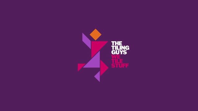
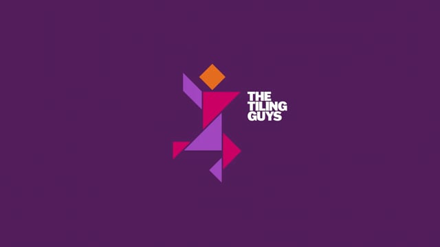
We were immediately drawn to the concept of a ‘tangram’; which is a square dissected into seven smaller shapes known as ‘tans’. The tans can be moved around to create whatever the imagination can conceive; a cat, a boat, a swan, or the figure of a person (which became our logo icon). And with there being more than one billion possible combinations of tans you have an almost endlessly flexible logo design.
The “Tiling Guy” icon is about no-nonsense tiling and customer service. It is designed to connect with customers and suggest a personal, hands-on approach — it’s more than just tiling; it’s about solving people’s problems, having a cheerful conversation with a reliable friendly face.
Our softer, more feminine colour palette was deliberately selected to connect with the largely feminine customer base and stand out against what is generally perceived to be a masculine industry. We created a vibrant look and feel along with applications and marketing material that would give the brand a leadership position and get noticed by customers.
Six months after launch “The Tiling Guys” has had a tremendous impact and success across the Wirral Peninsula. The business has earned a solid reputation for professionalism and problem-solving. Feedback from customers has been overwhelmingly positive; with comments like “we are over the moon” and “I wouldn’t trust anyone else” their future is secure.
According to Mark, “I attribute much of our success to our branding. It immediately positioned us as something different, whilst being familiar and reliable! It has helped us achieve more than I could ever have imagined!”.
Off the back of this early growth the business is now looking at regional expansion across the North of England and creating franchising opportunities. This fast paced small business success is a testament to the hard work and dedication of our client, with just a ‘little help from a designer!’