More

Work
Bright Software
rsor scroll FIX
Client

Bright Software

Sector
Technology
Disciplines
Strategy
Naming
Design
Architecture
Communication
Brand Culture
Campaign

Making a ‘brighter’ digital asset management brand one of the best places to work in the UK

Bright Interactive is a software developer based in Brighton (hence the name) in the United Kingdom. They are the creators of AssetBank, a leading Digital Asset Management platform which organisations use around the world to manage their digital assets such as images, videos, presentations and documents. DAM is a saturated marketplace with many developers offering similar kinds of products to AssetBank. We were asked to create a vision for the future with a new brand that would attract talent, facilitate product development and make them stand apart from competitors to enable growth.

Being brighter

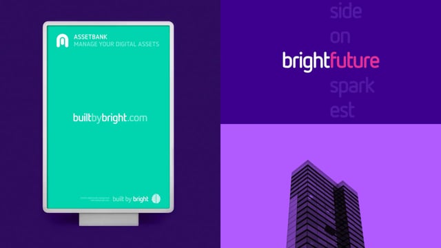
The original brand architecture was dominated by the AssetBank product brand with Bright Interactive used in the background. This was a significant barrier to expanding their portfolio and marketing new products and services. Being known only for one product impeded innovation into new software categories. What’s more the AssetBank name was misleading to new potential customers as it suggesting a financial services company.

The bright stuff

We conducted in depth research to understand how Bright Interactive’s original strategy and brand stood up to their competitors and what made them special. We defined their brand culture and a new brand strategy which would appeal to both an internal and external audience. Based around the idea of Inventive Intelligence our strategy emphasised the ingenuity and creativity of Bright and how they helped their customers. Having examined the brand architecture and naming we deleted the word Interactive to make Bright the master brand. AssetBank and other products would sit underneath this umbrella to refocus attention on the parent company.

Brighter creative

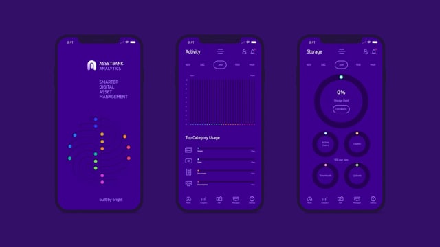
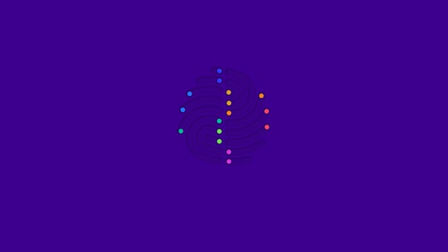
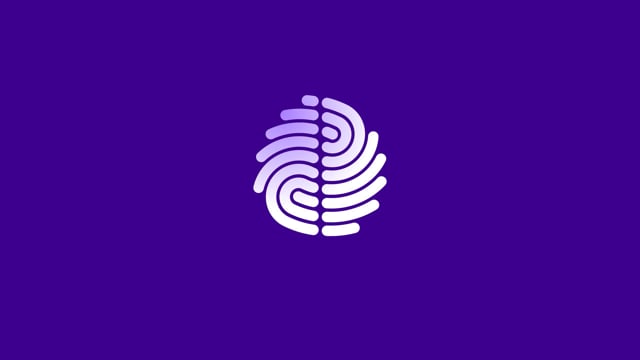
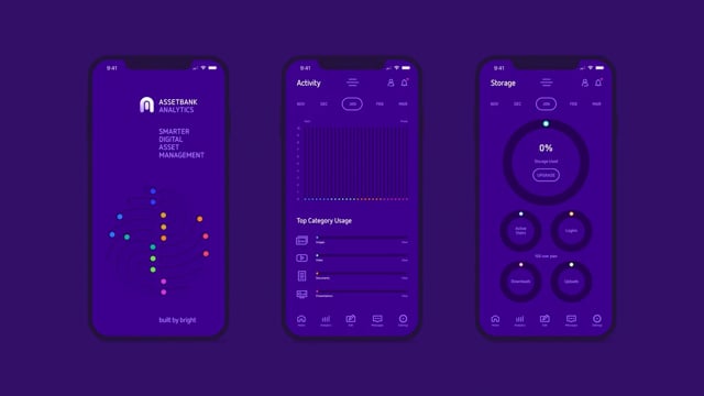
Our new Bright logo icon is composed of an abstracted finger print and a brain merged together to suggest the inventive intelligence of the organisation. We redesigned each product identity as rounded simple monograms to echo the style of the master brand icon. Our new brand look and feel is composed of a huge range of symbols combined with black and white photography overlayed with vivid colours to represent product functionality.

A bright future

Our work was enthusiastically adopted across the organisation and by customers. Bright are now ranked as the 5th Best Tech Company to Work For in the UK and 26th out of all companies in the UK. Since relaunch of the brand they have added two new products to their portfolio and increased the customer base by 372%.

Bright Interactive AssetBank competitive digital asset management software companies
Bright Interactive AssetBank digital asset management staff vox pops research
Bright Interactive AssetBank digital asset management brand naming
Bright Interactive AssetBank digital asset management logo icon design idea brain fingerprint symbols
Bright Interactive AssetBank digital asset management - the concept of intelligent asset management
No items found
Open story
Next project arrow symbol
Cursor scroll FIX
Bright Interactive AssetBank digital asset management iPhone app icons logos
Bright Interactive AssetBank digital asset management apple laptop stickers
Bright Interactive AssetBank digital asset management look and feel poster design
Bright Interactive AssetBank digital asset management design of graphs charts and information graphics Apple Watch app design analytics
Bright Interactive AssetBank digital asset management logo design for master brand and products logos
Bright Interactive AssetBank digital asset management packaging design and carrier bag
No items found
Bright Interactive AssetBank digital asset management look and feel poster design
Bright Interactive AssetBank digital asset management look and feel employer brand design prospectus brochure
Bright Interactive AssetBank digital asset management look and feel employer brand design event exhibition t-shirts and lanyard
Bright Interactive AssetBank digital asset management look and feel application iPhone case packaging design
Bright Interactive AssetBank digital asset management application design umbrella
No items found
Cursor scroll FIX

Propella’s creativity helped us become one of the most desired technology companies to work for in the UK.”

Angela Nyman
Global Head of Marketing
Bright Software
Bright Interactive AssetBank digital asset management symbols icons product functionality
Bright Interactive AssetBank digital asset management brand identity icon brain fingerprint symbol
Bright Interactive AssetBank digital asset management look and feel guidelines colour palette, typography and small symbols
Bright Interactive AssetBank digital asset management stationery design business cards
Bright Interactive AssetBank digital asset management stationery design letterhead, compliments slip, business cards and pen
No items found
Cursor scroll FIX

See more work